
Is your office stuck in a sea of beige? Are you an architect, interior designer, or business owner looking to revitalize your workspace and unlock the hidden potential of your employees? It’s time to ditch the drab and embrace the power of color! The strategic use of color psychology in office design is more than just aesthetics; it’s a science-backed approach to boosting productivity, creativity, and overall well-being. Research shows that office colors can significantly influence cognitive performance, with specific hues capable of elevating productivity by up to 30%. Capital Choice understands Central Ohio’s dynamic business furniture landscape, where 67% of designers now favor richer, more dramatic palettes. Moving beyond neutral beige unlocks tangible operational benefits. Let’s explore five unexpected color palettes that can transform your office into an inspiring and high-performing environment.
The Science of Color Psychology in Workplace Performance
Color isn’t just a visual element; it’s a trigger for neurobiological responses that directly modulate human performance. A fascinating study from the University of British Columbia revealed a 15% productivity difference between blue and red environments, highlighting how chromatic wavelengths influence cortisol levels and cognitive processing. Think about it: blue wavelengths (465–485 nanometers) can suppress melatonin production, enhancing alertness during analytical tasks, while green (520–565 nm) reduces sympathetic nervous system activation by 30%, lowering physiological stress markers.
These effects translate into real-world behavioral changes. Workers exposed to biophilic green elements report 20% higher creative output, while those in monochromatic blue zones exhibit 35% faster task completion. Neuroimaging studies shed light on why: warm hues (620–750 nm) stimulate the amygdala, increasing heart rate and adrenaline secretion—ideal for collaborative ideation but detrimental to sustained focus. Conversely, cool tones activate the prefrontal cortex, supporting executive function during complex problem-solving.
The implications for office furniture integration are profound. Imagine ergonomic chairs in sage green reducing visual fatigue during long meetings, or blue-accented workstations improving concentration duration by 40%. Choosing the right colors for your new office furniture is an investment in your employees’ performance and well-being.
Quantifiable Impacts on Organizational Outcomes
- Productivity Metrics: Tech startups implementing cobalt blue accent walls documented 35% higher meeting room utilization and 22% shorter project cycles.
- Well-being Indicators: Healthcare facilities using terracotta tones saw patient-facing staff report 30% lower burnout rates.
- Economic ROI: Companies investing in evidence-based color schemes recorded a 15:1 ROI through reduced absenteeism and 20% higher employee retention.
Emerging Color Trends in Office Design
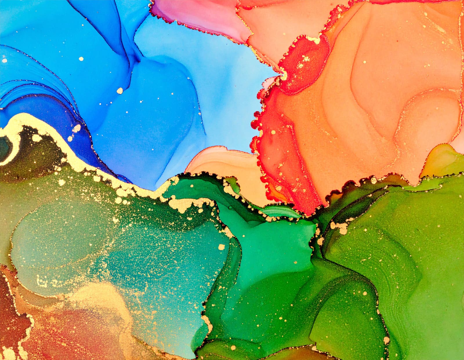
The current commercial palette is shifting towards sensory-rich, psychologically optimized environments. Pantone’s Mocha Mousse (Color of the Year) anchors earth-inspired schemes, while Pinterest’s forecast highlights Butter Yellow and Dill Green as dominant productivity enhancers. Here are five key color palettes to consider for your office design:
1. Biophilic Greens: The Nature-Connection Palette
Psychological Profile: Reduces eye strain by 45% and boosts creative thinking by 20% through parasympathetic activation. Ideal for creative agencies and R&D departments.
Furniture Integration:
- Vertical garden walls paired with moss-green task chairs.
- Live-edge wooden desks with emerald glass partitions.
- Modular sofas in forest-green performance fabric.
Case Study: A Barcelona tech firm recorded 25% faster prototyping cycles after installing hydroponic walls and olive-toned collaborative furniture.
2. Energizing Yellows: The Cognitive Activation Palette

Psychological Profile: Stimulates dopamine production, elevating mood and ideation frequency by 52%. Best for brainstorming zones and startup incubators.
Case Study: FreshBooks’ Toronto office used warm yellows in communal areas, driving 20% higher project output and 31% more cross-department collaborations.
Furniture Integration:
- Mustard-yellow acoustic pods for focused work.
- Butter-yellow mobile whiteboards.
- Sunflower-hued lounge seating with walnut frames.
3. Calming Blues: The Deep Focus Palette
Psychological Profile: Enhances concentration duration by 40% and reduces errors in technical tasks by 18%. Optimal for finance, legal, and engineering sectors.
Furniture Integration:
- Navy-blue sit-stand desks with matte finishes.
- Cerulean soundproof phone booths.
- Teal modular storage systems.
Case Study: Adobe’s San Jose development wing reported 15% higher code efficiency after transitioning to blue-drenched.
4. Earth-Inspired Tones: The Grounded Productivity Palette
Psychological Profile: Ochre and terracotta promote emotional stability, increasing complex decision-making accuracy by 27%. Ideal for executive suites and high-stress environments.
Furniture Integration:
- Terracotta leather executive chairs.
- Muted taupe conference tables.
- Clay-textured acoustic panels.
5. Bold Accents: The Strategic Stimulation Palette
Psychological Profile: Burnt orange stimulates physical activity, while cobalt blue enhances logical precision. Used strategically, they boost energy-intensive tasks by 25%.
Furniture Integration:
- Cobalt blue filing cabinets in accounting departments.
- Burnt orange stools in manufacturing oversight stations.
- Deep purple focus pods for creative teams.

Best Practices for Central Ohio Workspaces
- Zonal Energy:
- Focus zones: Blue/green office furniture (task chairs, desks)
- Collaboration areas: Yellow/orange elements (mobile tables, writable surfaces)
- Recharge spaces: Earth tones (sofas, planters)
- Biophilic Synergy: Combine colors with natural materials – wood-grained desks with green upholstery, or terracotta tiles with live plants – to amplify stress reduction by 45%.
- Lighting Integration: Circadian-aligned LEDs (5000K morning/2700K afternoon) intensify color effects. Blue business furniture under 5000K light boosts alertness 2.3× more than neutral tones.
The Chromatic Advantage
The transition from beige stagnation to evidence-based color strategies represents the next frontier in workspace optimization. As Central Ohio businesses compete for talent, those implementing these five palettes – backed by 15–35% measurable gains in output, focus, and retention – will define regional workplace excellence. The integration begins not with wholesale renovation, but strategic furniture selection: a blue task chair here, a green modular sofa there, each acting as a productivity catalyst. And Capital Choice’s team of expert project managers can help select the proper commercial furniture for your needs.
How Capital Choice Office Furniture Can Help
Download our Brand Identity Guide, or schedule a consultation to prototype your chromatic strategy using our virtual reality office planner. Transform beige into brilliance – one hue at a time.